|
|
Baphomet Images - Take a Look
Information from Tani Jantsang
Below is OFFICIAL PERMISSION to use the first image shown here, #1 on the left, on this webpage. Further, permission is given by the email owner and sender Vicky of Panpipes Store, to use her email.
Look carefully: The differences in the goat image itself are quite clear:
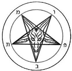
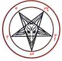
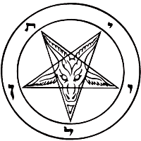
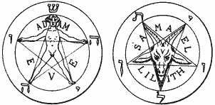
| #1. This image of a Baphomet was designed by "a person" and re-drawn / vectorized by Vicky from Panpipes. "A person" paid Vicky to do this. Official permission to use it from "the person" is below. See end for statements. | #2. This image is from an old, privately printed book given to specific Freemasons in the 1800s that was explaining Orphic Doctrines and basically some of the things that are extensively explained here. |
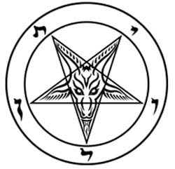 |  |
Everything about the ears is different; the part above and between the eyes is very different; the eyebrow part is very slightly different the eyes are different both inside the eye and around the eye; the nose is in another position relative to the lips; the nostrils are different; the beard is different; the entire positioning of the entire goat image is different. It is, quite visibly - DIFFERENT!
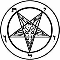
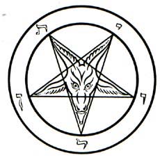
Compare both of these images to the Baphomet #4 that LaVey made below and you'll see that all three are similar. Compare these further to the #3 one below from Bessy's book cover and they are still similar. Compare further to three more images below Bessy's and LaVey's, images #5, 6 and 7. If anything, LaVey's image is a lot more similar to the first image here drawn by "a person," than is the image #2 from the book I saw the image in. And the three last images, #5, 6 and 7, you'll see here and the first image #1 from "a person" are even more similar.
Notably, on image #2, but not on any other images of this symbol, I notice that both the horns and the ears are made with 7 lines. The portion showing between the eyebrows but connected to the horns, has 7 points. Notably also, the letters around the image are not the same, which is clearly explained in the article we have mentioned above - they actually spell "Baphomet" and are a kind of clever code for the word Sofia (Sophia). As for the book, I do not remember the name of the book - it belonged to an old Freemason's grandfather and contained an essay by Plutarch; it also explained Orphism, Sophia and the accusations against the Templars. It is the only place I ever saw the word Baphomet also rendered Bahumid, which makes what it means extremely clear if you know what Bahu means! It wouldn't matter if anyone knew the book title. In the 1800s and even later, some books did get privately printed for members only. Then, they would be handed over, signed over to the person who is a member. I have seen such editions, often the pages were not cut completely to make separate pages after they were folded and bound and you'd have to take a knife and split them either on the side or top to make them separate pages. When the member dies, the book, or even collection of books, goes back to the organization. No one outside sees them, or is supposed to see them. There were no ISBN numbers back then, no xerox machines back then. Books of this type were printed, perhaps as little as 50 copies, for members of the organization only. This is not hard to fathom. The Temple of Set has done this with some of their books that are only for members. No one outside the Temple of Set is supposed to have one of these books, or see it. Today, however, with xerox machines and such, it's not so easy to keep "private books" out of the hands of the public. The book my Mason friend had, a book that belonged to his grandfather, was that kind of book. The grandson wasn't supposed to have it; he wasn't supposed to show it to me, either. For the record, the image has absolutely nothing to do with good or evil. That was an invention of Eliphas Levy's, as explained very clearly in the article mentioned above. I would imagine that books such as this became quite "taboo" after LaVey put the image on a book cover and called it "Satan." I can say I heard a lot of guff about it back then.
LeVay got the idea to use letters that spell Leviathan from a hard-cover book by Maurice Bessy entitled A Pictorial History of Magic and the Supernatural. Inside the book was the image also shown by us in the article we have mentioned above, where it says Samael and Lilith inside the star. That book also shows a picture of Freemasons in Scottish Rite standing in front of the Goat of Mendes, with a Rose Cross on the Goat's chest - it is on page 255, image #820. You can imagine that such books caused a lot of distress, but they weren't so well known. LaVey's Satanic Bible, with the Baphomet on the cover, was very well known. The fact of the matter is that this sigil was never a sigil of evil or demons or Satan. This is detailed in the article mentioned above - the cipher, a kind of code, shown in the article, clinches it.
I find it hard to fathom how an artist can't see that these images shown above are not "identical." Sure they are similar. All seven Baphomets shown here (see below) are similar. I have inverted the colors on all images below, when necessary so that they show up black lines on white background, making it easier to see.
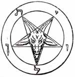
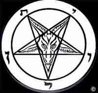
| #3. Bessy's Baphomet | #4. LaVey's Baphomet |
 |
|
There are more Baphomet images out there. Here are three more.
| #5. Satan Shop's Baphomet medallion, made by them, sold on eBay.. | #6. Audy Morgan of Satan Shop's design for a Baphomet Tattoo. |
 |
 |
| #7. Pan Pipe's Baphomet Stickers. Satan Shop had been buying these from Pan Pipes for awhile. | #8 This is the actual original image drawn by "the person" before Vicky fixed it. (See below) |
 |
 |
"The person" who gave permission to use his image, claims he designed, drew, this image himself and that Pan Pipes took it and sold it after he asked them to "clean up the circles." He also bothered Satan Shop (Aura) when they sold items they purchased from Pan Pipes. Vicky, of Pan Pipes, having looked at Image #1, has this to say. All references to "the person" by name have been removed at "the person's" request and replaced with "the person."
This is what Vicky, of Pan Pipes has to
say about this image #1 and #7 shown on this website:
QUOTE "Some time ago "the
person" had requested that I clean up and vectorize his rough rendering of
the Baphomet image. I'm a graphic designer by profession and I did charge him a
small fee for this service. To claim Panpipes stole this image is slander and I
give due warning to "the person" to cease and desist in his false
claims. Yes I did produce stickers and t-shirts bearing "the persons"
Baphomet, but they were wholesale items intended only for s*****s*****.com -
items, that I as a wholesaler under my unearthlydelights.com business name, he
paid me to produce. If one were to look at the Baphomet image used on my website
that is intended for the t-shirts and stickers one can see it is nothing like
"the persons" Baph, and no he didn't design the version #7 (Panpipes
baph) on this website. The Baph I use is from a old Templar book I have".
'The person' who gave permission to use
his image, #1 on this website, claims he designed, and drew, this image himself,
claims that this is his original version, and claims that Panpipes took it after
he asked them to clean up the circles. Ironically, prior to my knowledge of this
discussion, I had been thinking of changing the design a little as I executed it
in a hurry way back then...
Vicky
from Panpipes has this to say again:
QUOTE "Baphomet
No. 1, pictured on this website, is the one I (Vicky) drew. In "the
persons" drawing the points were majorly obscured within the inner circle
so the star appeared blunt, no pointed bits and his inner circle was much
thicker. Also his goat was not symmetrical like the one I drew. That #1 is not
his drawing. I have the vectorized art that proves it is the one I drew. He
actually produced these huge patens that used his rendering of the Baphomet,
produced them before I had a chance to fix it up. These patens show the cut off
points, the thicker inner circle and asymmetrical goat.
"In the email copied below it proves that
the illustration with the thicker inner circle is his, as I was asking him about
it. It also shows how much I hated dealing with his design so there is no way I
would steal it for my use
To: "the person" theperson@s******s*******.com
From: "Vicky Adams" <vicky@*************.com>
Hi xxxx,
The only reason I initially said no to
your Baphomet was because there are too many pieces on the ears and horns that
are not joined together, thus making it much more difficult to pluck. I try to
design things with as many joined elements as possible. Your design will be okay
to pluck on larger items such as the shirts and the 8" stickers, but a pain
on the 4" stickers... might even be difficult to cut the separate elements
out at this size as well. So if you really want, I can do your design on
everything except the 4" stickers. .... On your Baph design, did you
intentionally want the inner circle thicker than the outer one?"
Thanx,
^V^
END QUOTE
Be that as it may - the images here, none of them, are identical to the one I xeroxed from an old book, which is shown up top of this page on the right of the screen, image #2. - and that is my ONLY point - and that is the image we offer freely in the "Spells" section for anyone to go and use if they wish to use it. Satanic Reds does not use this symbol.
This below IS OFFICIAL PERMISSION to "use this one." It refers to the first image above from "the person." I had given him full credit, name, title, etc. He asked me to simply say, "the person."